Last night was pizza night. I was at a friend’s house, so I searched for a local pizza place on my phone. What appeared resembled more a grade school art project than a website. The text, pictures, links; everything overlapped, and was shrunken down to an incomprehensible size. After a few seconds of frustratingly squinting and attempting to navigate the crowded menus, I gave up and moved on; never looking back. It’s annoying, and Google thinks so too.
We’re a society that’s always on the go. Gone are the days of being tethered to a clunky computer, or even a laptop. An infinite wealth of knowledge is now available to us in the palm of our hand, and Americans are taking advantage of it. By the end of the year, it’s projected that mobile phone surfing will overtake desktop surfing.
With this in mind, Google changed their search algorithms last April to reward mobile-friendly websites, and penalize sites that are NOT mobile-friendly. As a result, Google hopes to give users the highest quality search results, regardless of screen size.
So, if your website does not meet Google’s new mobile-friendly standards, your ranking will plummet; resulting in a noticeable decrease in search engine traffic from both desktop and mobile devices.
Fortunately, Google provides a mobile friendly test that determines if your site meets their new standards. Go to www.mobile-compliant.com to check now!
How does your website look on a mobile device?
The key to having a good mobile website is to keep it simple and easy to navigate. If it’s too cumbersome, or users have to pinch and pull to navigate, they’re likely to leave your site for the next on the list.
When was the last time you looked at your website on a mobile device?
Please check now…
Mobile website vs. Responsive web design
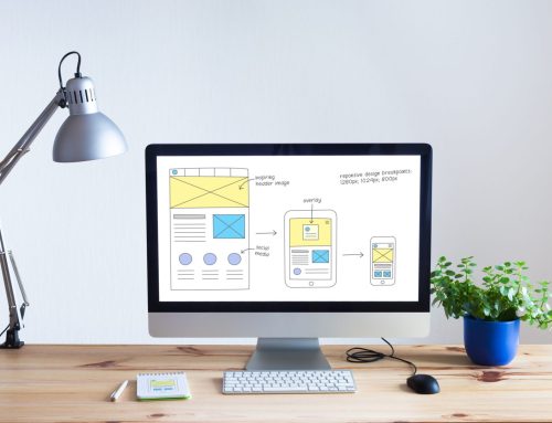
Responsive web development uses enhanced coding to ensure that your website adjusts automatically to the screen size of mobile devices, tablets and desktop browsers.
Today, your site needs to be both responsive and mobile compliant.
Depending on the platform you are using and the age of your site, we can sometimes change your current website to be responsive and mobile-friendly by altering the code. However, if you have an HTML site with Flash embedded, we will have to migrate your site to a modern, responsive, mobile-friendly design.
This might be the perfect opportunity to upgrade the design, content and photographs on your site so it’s easily accessible for everyone.
Whether you plan to update or redesign, having a mobile friendly, Google compliant site is extremely important to your company’s bottom line.
Contact the mobile compliant web design experts at Vortex Business Solutions with your questions on updating your present site or creating a new mobile-friendly/responsive website.
A free consultation is available by calling 319.621.0191
Call Today!


